


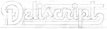
Deuce'n'views: Michael Doret talks about his art and KISS new album cover


Hello world!!!
Today, August the 10th,I have the pleasure to introduce you to Michael Doret….Yes,that Michael Doret, the Rock and Roll Over cover art father!!!
Hi Michael!!
Hello Fabio!
I am perfectly aware that such definition is way beyond complete as You are among the best designers around and that your art can be seen everywhere, but…you know, we are so next to the D-Day to see
the new KISS album title and cover revealed that….;-)

I would like more than anything right now to share with you what I did for the new cover. I am very excited about it because I think it is among the very best of my
work. But an agreement is an agreement: I gave my word to Paul that I would not reveal anything before the "official" release of information, and I am a man of my word.
Going through your
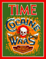
bio I read you have an amazing list of customers such as The NBA, Major League Baseball, Walt Disney Imagineering, Warner Bros., Universal Studios, Nike, Adidas, Time Magazine, United States Postal
Service, Playboy, Capitol Records, Columbia Records and many more, how is working with such big Company? Did they leave you free to create or the came to you with precise input to follow?
I treat all clients the same, whether they're big or small. The budget a small client has to spend on a project may be less, but nevertheless if I take on a design
assignment I always give it my best effort. The difference is that with a bigger budget I may be able to have the luxury of taking more time on a project.
Some larger clients are better than others. They're like people: some you like more than others—not everyone is cut from the same mold. TIME Magazine was really wonderful to work for. The people
there understood totally what I was trying to achieve, and gave me the creative freedom to see my vision through to completion. On the other hand the NBA was more difficult to work with. When working
with them on a logo, they would put me through many more changes than were really necessary, and the result was not 100% of what I would have hoped it would be.

You stated that "with few exceptions the letterforms that you see in my work are unique—created by hand." What’s your opinion about nowadays technology, meaning computers and software? And how you integrate them into your creative process?
When I started my career it was many years before personal computers appeared. All my work was either drawn on mylar with ink with a pen, or painted with gouache on board. Around 14 years ago I made the transition (thanks to the encouragement of my wife, illustrator Laura Smith) to the Mac. But making that transition didn't change the nature of my work at all. Rather it expanded the possibilities of what I could achieve. I think that I'm in a unique position, having had my feet in both the analog and digital worlds. Even though my pen and ink is now a mouse and a keyboard, I still would describe that what I do is created "by hand". I still start all projects by drawing sketches with a pencil on paper, and my letterforms are usually created not by setting type or using fonts, but by painstakingly constructing them piece by piece in Adobe Illustrator. In the past I created them with ink—now I create them from vectors. Here are two samples of work I did. One was done before the Mac and one after. I'm confident you won't be able to tell which is which. Check them out:

Can you tell which was created with ink, and which is digital?
Well,...no!!!
I am critical of young designers' complete dependence on computers. When a student asks me questions about my work they don't ask "What was your thinking process that
led you to this solution?"—rather they always ask "What application do you use—Illustrator or Photoshop?" Their dependence on the computer is leading to a generation of Illustrators and designers who
have no grounding in the basics of art and design. They actually believe that their extensive knowledge of digital art programs will help them through any and all design problems. Nothing could be
farther from the truth. So computers to my mind are fine, but only if they are seen in their true context—just as another tool among the many in the arsenal that designers have at their
disposal.
Surfing the net I crashed into this definition of you: “Michael Doret is to typography what Jimi Hendrix was to the electric guitar - he’s in a league all his own. There’s
typographers and then there’s Michael Doret. Inspirational Work!” What a cool comments on your art!!! Do you recognize yourself in that definition? And how you would describe your works?
Wow! That's very flattering. Personally I would never be so bold or egocentric as to describe myself like that. I just have a vision, and I try to implement that vision
in my work, whether it's a small project or a large one. I always attempt to solve a client's problem while at the same time not compromising my integrity. If that makes me a "Jimi Hendrix" who am I
to complain?
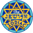
Together with the KISS project I saw you are working on The Jewish Zodiac where you created the images from photographs and then integrate them into twelve unique deli label designs. Did you
follow the same process with the KISS album cover?
Actually I did. (How did you know?) In both cases I was provided with existing photography that I needed to incorporate into the finished design. In both cases I felt
that the photography was lacking a certain "graphic" quality that it needed to have for me to include it in my finished art. For the "Jewish Zodiac" pieces I developed a process where I reduced a photo to its various graphic components—breaking it down—and then putting it back together, but with a "twist". So I
was able to take some fairly low contrast, fairly soft focus photos of Paul, Gene, Tommy and Eric, and transform them through that process I had developed into much more dynamic "colorized" images
that I was then able to incorporate into my design.
We all know that this will be a Paul Stanley’s creature as he is the only producer of the album; Gene Simmons said the album title came
out from a Paul’s idea/vision. Did he came to you with a clear indication or title to develop the cover or did you showed him some sketches to be worked out?
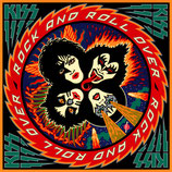
Paul came to me with the title of the album. We talked about the "look" he wanted this cover to have. We talked about how the other cover I had done for them, "Rock
and Roll Over", really had become iconic and now represented KISS' music from that early period. He talked about how he'd like the new cover to to be suggestive of that look, because they wanted the
music in the new album to be more reflective of that time and, of their roots in hard rock. He also stipulated that I needed to use existing photography of the four members instead of creating
graphic caricatures (which is what I did in RARO). So that was my challenge: create another iconic cover that would also be reflective in some way of the previous cover.
When I did RARO I presented the group with one colored pencil drawing. With only a few minor comments, they approved it. After thinking about what I needed to do for this new cover, I spent a week or
so creating sketches, then narrowed it down to one which I presented (very nervously) to Paul. Like the first time around, he immediately loved it. Then it was just a matter of refining the sketch,
selecting the photos, working out a color palette, and presenting it all to Paul again. You will soon be able to see the result of this process .
I saw you are selling Limited edition
signed silkscreens created to celebrate the release of new fonts from Alphabet Soup Type Founders.
Yes, In the last few years I started creating my own fonts, trying to bring my many years of experience with letterforms to bear on the world of font design. I
started Alphabet Soup Type Founders in 2003 to be the face of that aspect of what I do. I had the idea that I'd do
posters demonstrating an interesting use of the fonts as a way of promoting them. It was never going to be a money-making proposition—just a fun thing for me to do. I ended up creating signed serigraphs, and have sold quite a few of them. There are still some left if your readers are interested, but I'd probably have to add a few
dollars to cover the postage from the USA to Italy.
Are you planning to do something similar with the new KISS Cover art?
Yes. But with the cover art for the new album it will probably be a little different. I first had the idea that I would create large scale limited edition signed prints
and then sell them myself. But then I talked with Paul, and he really liked the idea, so now I'll probably be doing them in conjunction with KISS. The idea would be to produce limited edition signed
giclées that not only would be signed by me, but by members of KISS as well. Also it looks like we'll also be doing a large scale print of "Rock and Roll Over" to be sold in tandem with the print of
the new cover. This also was my idea—to tie the two together, as they are both related. There has been plenty of merchandise with the RARO image, but nothing of any quality in a large size. As the
artwork for RARO has disappeared in the sands of time, I have to re-create the artwork digitally, otherwise at the large size of the giclées (hopefully around 25" square) it would look terrible. This
is all very tentative as we haven't worked out all the details yet. I will post an article on my blog when the details have been
finalized. So keep watching!
Thanks a lot for you interesting words!!! Really appreciated! Have you some new projects or new ventures in the pipeline to share with us?
Well, I have a new font that I've designed that should be coming out soon. It'll be called "Chrysler" (named after the Chrysler building in New York), and it'll be an
extreme Art Deco style. If you go to this page and scroll down about halfway you'll see where I talk about it. When I did that
interview I actually didn't know that I was going to turn that design into a font. I only decided afterwards.
Michael, thanks again for you time and your art! Looking forward to meet you
some time soon (a new DeuceNews artwork and logo?) Ciao Fabio
You're very welcome. The pleasure is mine!